OptymEdge

OptymEdge is a specialist partner for ophthalmology clinical trials.
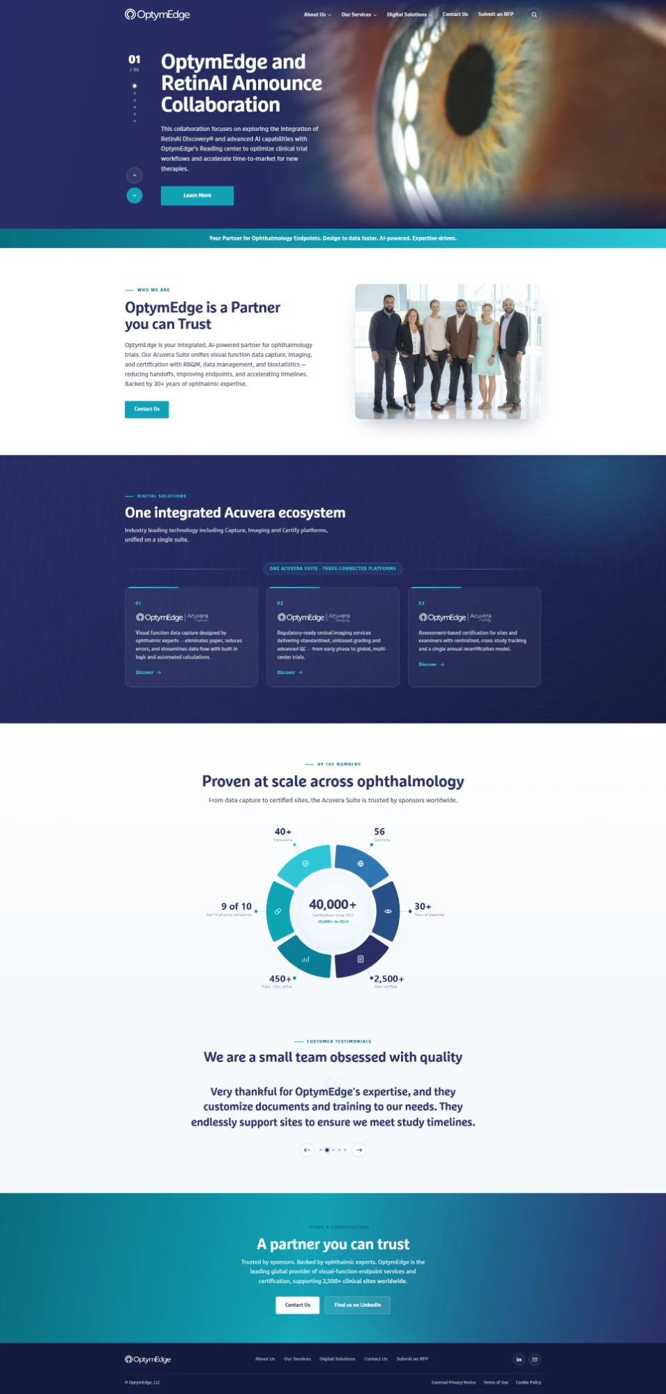
They provide visual-function endpoint services and certification across the entire data lifecycle — from imaging and data management to biostatistics — and connect it all through their own technology, the Acuvera Suite.
It is a serious, regulated field. Sponsors and CROs choosing an endpoint partner are trusting them with the integrity of trial data, so the brief for the website was never decoration — it was credibility. The site had to read as precise, global and quietly confident, and it had to make a technical service legible to a scientific audience that has no patience for marketing noise.
The result pairs OptymEdge's scale — more than three decades of expertise, a presence spanning dozens of countries, and work with the majority of the world's top pharma companies — with a clean editorial design that lets each service, product and proof point stand on its own.
Project summary
 Strapi
 Node.js
 JavaScript
 HTML5
 Tailwind CSS
 Responsive
 UX/UI
01The challenge
What stood in the way
The hard part of this project was not visual — it was translational. OptymEdge sells something genuinely technical: visual-function endpoints, ETDRS protocols, imaging, RBQM, biostatistics, and a three-platform suite that spans all of it. Say too little and a scientific audience doesn't trust you; say too much and everyone else is lost by the second paragraph.
So the design had to do two jobs at once — establish deep credibility with sponsors and CROs, while keeping the site open and readable for the wider decision-makers around them. Every page had to feel authoritative without becoming a dense document, and the Acuvera Suite had to come across as one coherent ecosystem rather than three products fighting for attention.
OptymEdge needed a website that could carry a complex, regulated service with clarity and authority, and present the Acuvera Suite as one connected ecosystem rather than three disconnected tools. The working list was short but exacting:
- A high-trust visual identity suited to sponsors, CROs and scientific reviewers
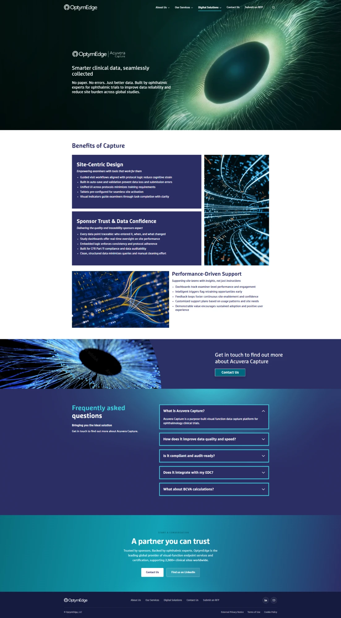
- Clear product pages for the three Acuvera platforms — Capture, Imaging and Certify
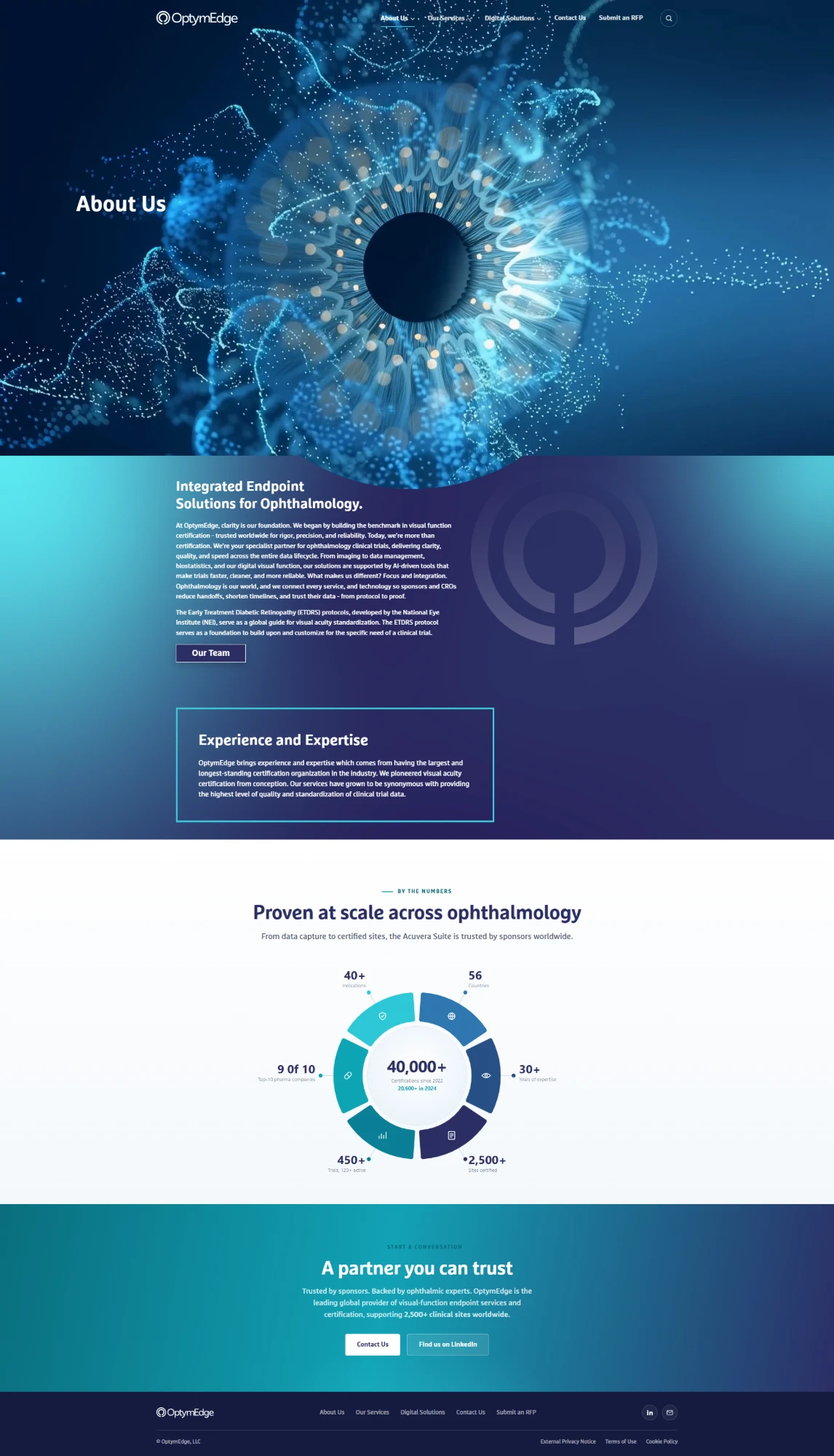
- An at-a-glance way to communicate scale and proof without a wall of text
- Motion that supports the story rather than distracts from it
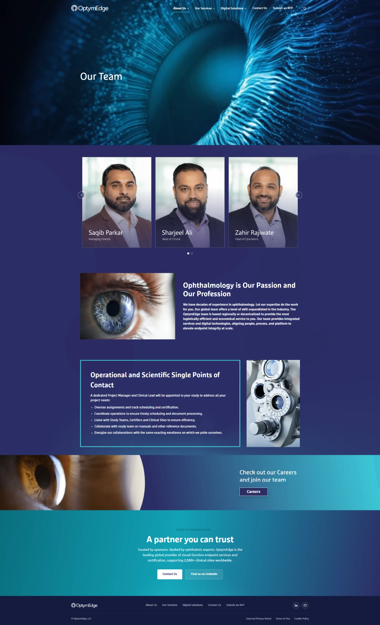
- Strong team and trust sections to put faces and expertise behind the service
- Clear conversion paths — contact, submit an RFP, careers — on every page
- A fully responsive build that holds up on every device
- A clean, search-friendly foundation for long-term growth
02The work
What we shipped
03The build
Key features
Every section earns its place: the motion points the eye where the story goes next, the data is shown rather than claimed, and the Acuvera Suite is presented as one system told in three chapters.
04The stack
Tech and integrations
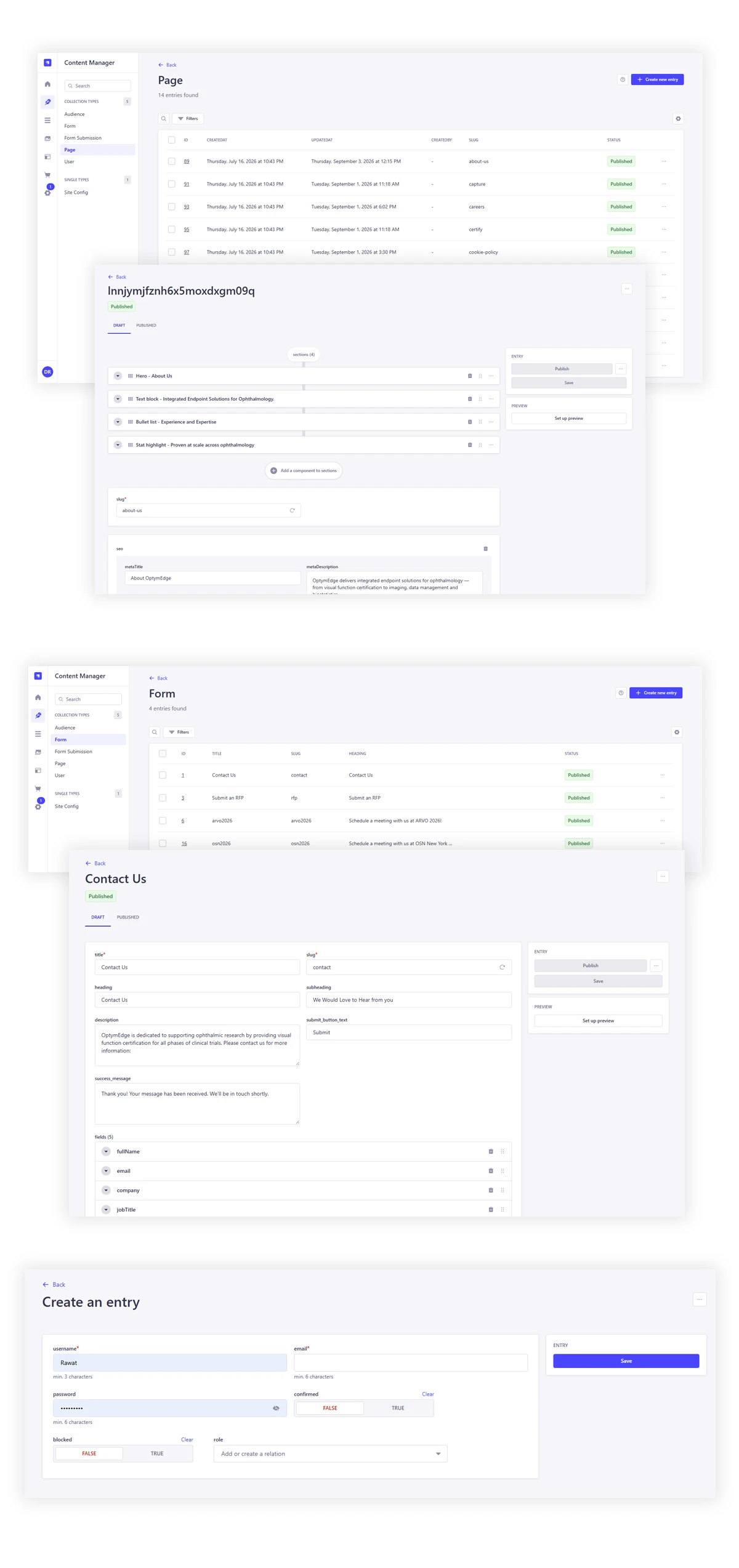
The OptymEdge site is a custom front-end build on a Strapi headless CMS, so the team can keep news, product pages and the leadership roster current from one admin without touching code. The motion and the data visualisation are hand-built rather than bolted on, which keeps the page light and the brand consistent.
Key technical highlights:
- Strapi headless CMS driving every page, product and news item
- Particle-rendered iris and retina hero visuals
- Custom "By the Numbers" circular data visualisation
- Scrollspy sticky sections and on-scroll reveals
- Rotating announcement hero and testimonial slider
- Accessible FAQ accordions on product pages
- Fully responsive layout with lazy-loaded media
- Semantic, search-friendly markup and metadata
Tech stack used for OptymEdge
Strapi
Node.js
JavaScript
HTML5
Tailwind CSS
Responsive
UX/UI
Strapi
Node.js
JavaScript
HTML5
Tailwind CSS
Responsive
UX/UI
Strapi
Node.js
JavaScript
HTML5
Tailwind CSS
Responsive
UX/UI
Strapi
Node.js
JavaScript
HTML5
Tailwind CSS
Responsive
UX/UI
05Capabilities
Services in this project
06Questions
Questions about this project
01What does OptymEdge do?
OptymEdge is a specialist partner for ophthalmology clinical trials, providing visual-function endpoint services and certification across the data lifecycle — from imaging and data management to biostatistics — connected through their Acuvera Suite.
02What did VOCSO build for OptymEdge?
VOCSO designed and developed the OptymEdge corporate website: the homepage, About Us, Our Team and the three Acuvera product pages (Capture, Imaging and Certify), along with the animated hero visuals, the interactive "By the Numbers" data graphic, the team and testimonial sections, and the conversion paths across the site.
03How does the site handle such a technical service?
Through editorial restraint. The design uses clear hierarchy, a consistent section rhythm, and motion that paces the reading, so a scientific audience gets the depth it needs while the wider decision-makers around a trial can still follow the story.
04Is the website responsive?
Yes. The layout, the particle hero and the circular data visual all reflow cleanly from large desktop down to mobile, with media lazy-loaded so the heavy visuals never slow the first view.
05Can OptymEdge update the site themselves?
Yes. The site is built on a Strapi headless CMS, so the team can keep news, product pages and the leadership roster current from a single admin without developer involvement.