

Table of Contents
Consumers today are more demanding than ever, especially when it comes to the digital world. They expect an attractively designed, intuitive interface which loads in seconds when they browse a website and will vote with their eyeballs if they find something that does not meet their exacting standards.
In fact, statistics gathered across a broad range of industries suggest that:
- 38% of visitors will leave a website if they find the basic layout or content unappealing
- 47% of people expect a web page to load in under two seconds;
- The vast majority (95%) of people believe that the most important element of any website is the user experience (UX); and
- If the quality of web design has become degraded, 94% of people will stop trusting, or using, a website altogether.
Many businesses that regard their website as an integral element of their online marketing strategy may not realize that poor UI design might be costing them heavily in terms of page views, click-throughs, and conversion rates.
Table of Contents
Here Are 21 Common UI Design Mistakes
#1. Cluttered Layout
Users find websites that are too cluttered very frustrating. They lack visual order and can overwhelm people as they struggle to understand which the most important elements are, and where they should focus their attention. Typically a website page can feel cluttered if:
• There is too much content – especially text – on the screen;
• There appears no logic or order to how the content is displayed; and
• The visual design is unappealing, or colors and fonts clash too stridently.
[Tweet ““Web design is not just about creating pretty layouts. It’s about understanding the marketing challenge behind your business. ― Mohamed Saad””]
Not knowing where or what to look for on a page can make visitors turn way, meaning a lost sale or potential conversion.
“A mistake I often see is not using authentic content during the design phase. Text (as an example) plays a significant role in modern designs but once the product is released, perfect text examples are replaced with real content. That’s where the harmony ends and various issues arise: lengthy sentences that don’t fit-in, misaligned labels, gaps between rows, and clutter (and that’s before even getting into localization challenges).”
– Gil Bouhnick is the CTO & CoFounder of Missbeez and owner of the Mobile Spoon. Follow him on Twitter @GilBouhnick
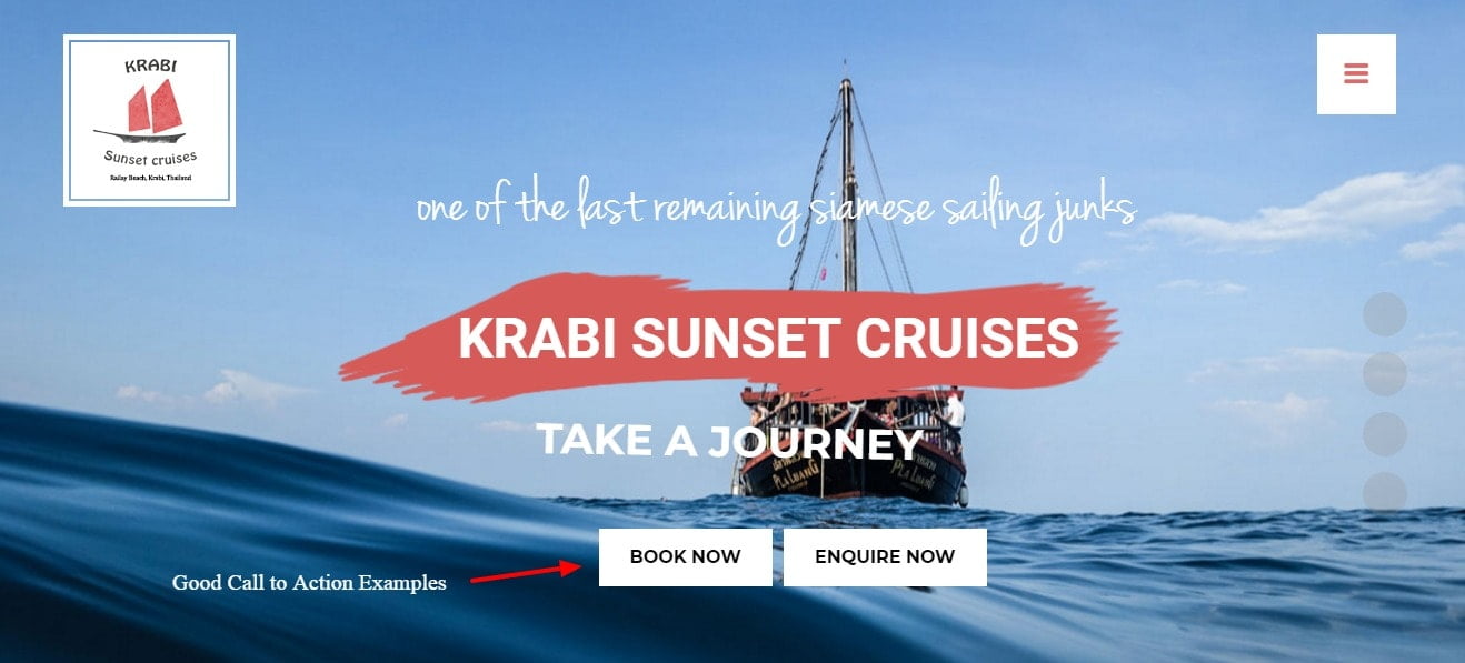
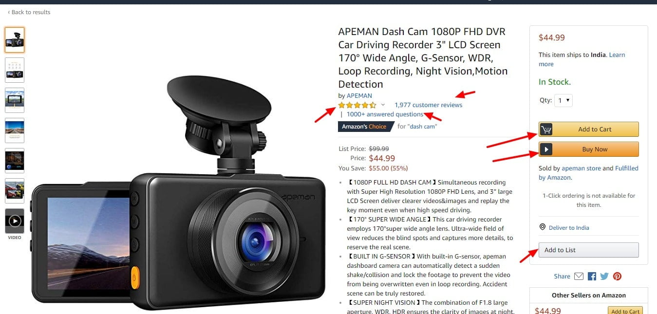
#2. Uninviting CTAs (Call to Actions)
Arguably, the CTA (Call to Action) buttons are the most important element on any landing page. They are the device that converts a random visitor to a website into a potential client. It is, therefore, vital that the CTA buttons are prominent, appealing and easy to use so that visitors are direct to perform the actions that you want them to, whether it is to direct them to a product page, shopping cart, or checkout facility.
[Tweet ““Obeying a prophetic call to action brings positive benefits.” ― Sherry K. White, Walking in the Father’s Riches: The Prosperity of Sonship”]
When assessing whether their CTA buttons are effective, businesses need to ask themselves the following questions:
- Is the CTA clear and unambiguous? Is it action orientated and induce a sense of urgency on the part of the visitor?
- Is the button placed in the right spot on the page? Can it easily be located? and
- How easy is it to use? Does it stand out from the rest of the page and grab the attention of the visitor.
#3. Unintuitive Navigation
A website should be organized and easy to navigate. That means it should have a hierarchy and a logical order that is easy to follow, with headings and sub-headings that clearly relate to each other, and are worded clearly and unambiguously,
[Tweet ““Human’s moral compass doesn’t work yet in worlds where the instinct navigates life.” ― Toba Beta, My Ancestor Was an Ancient Astronaut”]
Always provide a menu and locate it where users expect to find it – either vertically on the left-hand side of the page as a sidebar, or horizontally along the top of the page. And do not include too many items in your menu – six or less is the recommended amount.
Navigation has to be intuitive for the average user – if they find it too complicated or do not know where to look, they will simply go elsewhere.
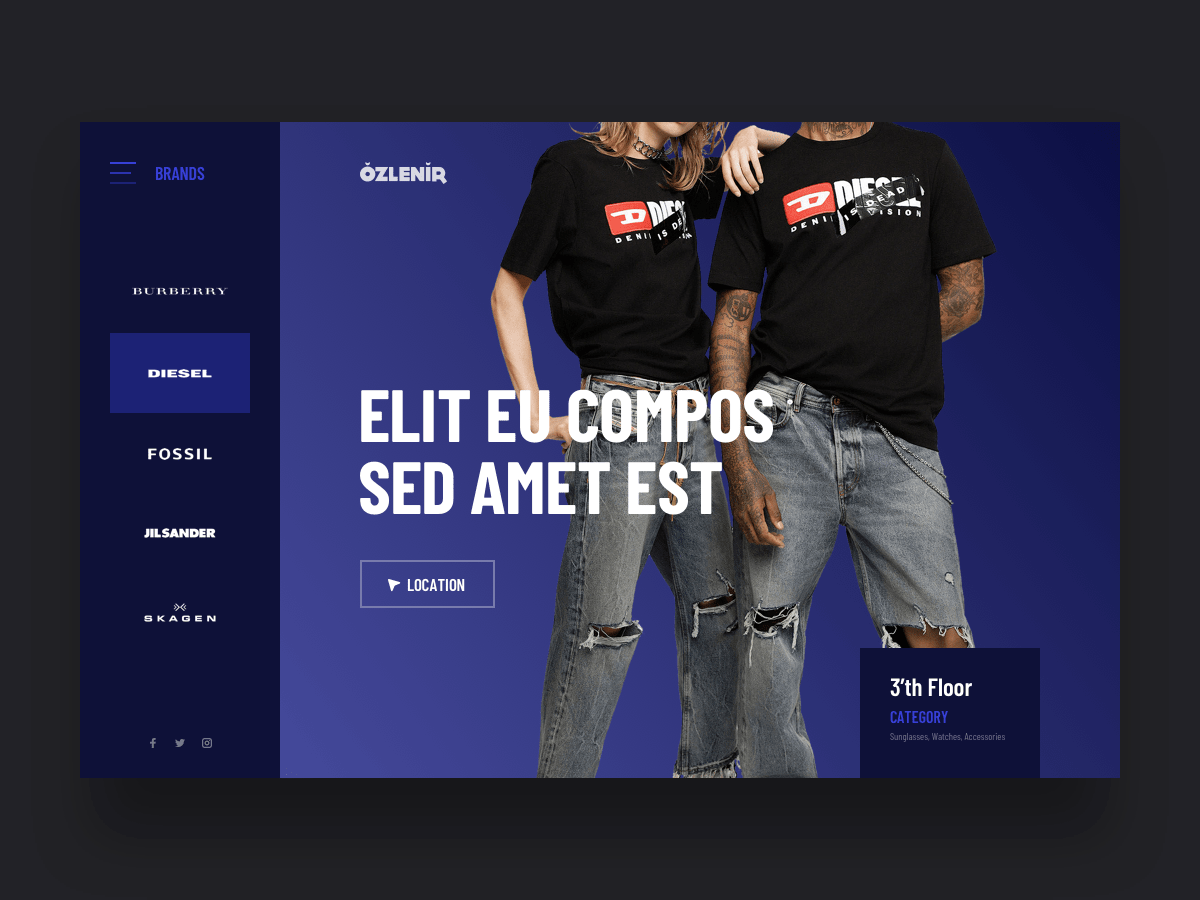
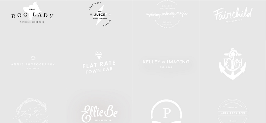
#4. Generic Imagery
Generic imagery is the use of stock photos and other obviously fake images to sell or promote products or services. The problems with these types of images are two-fold – not only are the pictures themselves not genuine, but they are generic – the same images can be found on multiple websites.
A picture paints a thousand words they say, and a good arresting image that can be a powerful marketing tool, engendering a feeling or trust and even well-being in a customer. But a generic image just undermines that trust immediately.
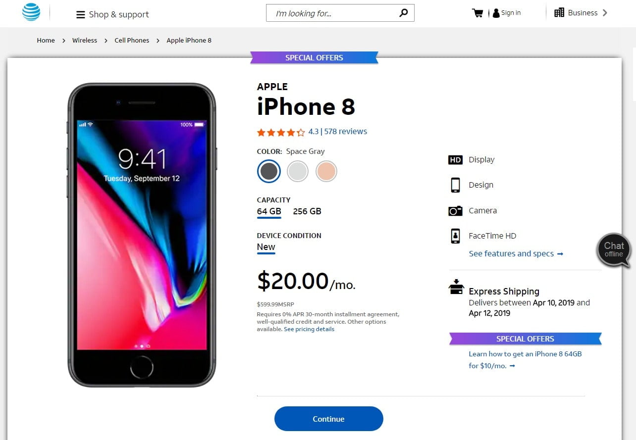
#5. No Social Proof
Social proof is the idea that people will conform with norms in order to be liked, or accepted, by society. Consumers buy products that make them feel good about themselves, but they are looking for reasons that what they are doing is the right thing. That means that they look to online product reviews, testimonials, and trust icons to guide them when making a purchasing decision.
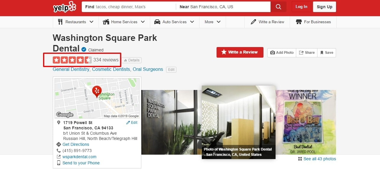
Research has shown that 85% of people will read online reviews before making a purchasing decision. They act as a valuable part of the buying process.
[Tweet ““Man is a social being; it’s not surprising we love social proofs, it sells brands fast” ― Bernard Kelvin Clive”]
If your website does not have online reviews or testimonials from prior or existing customers, there is no social proof, and visitors are much less likely to proceed with a sale.
#6. The Absence Of A Style Guide
A style guide is a set of visual standards for the formatting and design of a website. They ensure uniformity of design across a site, helping avoid inconsistencies such as different fonts and text sizes, colors or sizes, or the use of different styles.

Best practice suggests that a UI designer should create their Style Guide once they have understood the brief for a website, but before they begin designing the individual pages. This not only ensures consistency but saves them a lot of time – many of the graphical elements will already exist and do not have to be created from scratch.
#7. Text & Graphics/Image Ratio
Too much text and too little images or graphical content can impair the user experience of a website. There is no exact formula as to what is the right balance, although some experts suggest a minimum of 60% text and a maximum of 40% graphics or images.
Best Practice Suggests:
- Find the balance that makes sense for your business;
- Use enough text in the body of your message so that viewers can get all the key points without overwhelming them;v
- Adopt a heavier use of images for people viewing websites on mobile devices, as these are easier to view than reams of text;
- Test the text to image ratios on a continual basis to determine the optimal configuration for business.
#8. Slow Page Loading Speed
However good the rest of your design, if your web pages take too long to load, you will automatically lose a lot of your traffic. Research has shown that 47% of people expect that a web page should load in two seconds or less. The same study also demonstrated the cost to businesses of just one second delay in page load times – 11% fewer page views, and 7% fewer conversions.
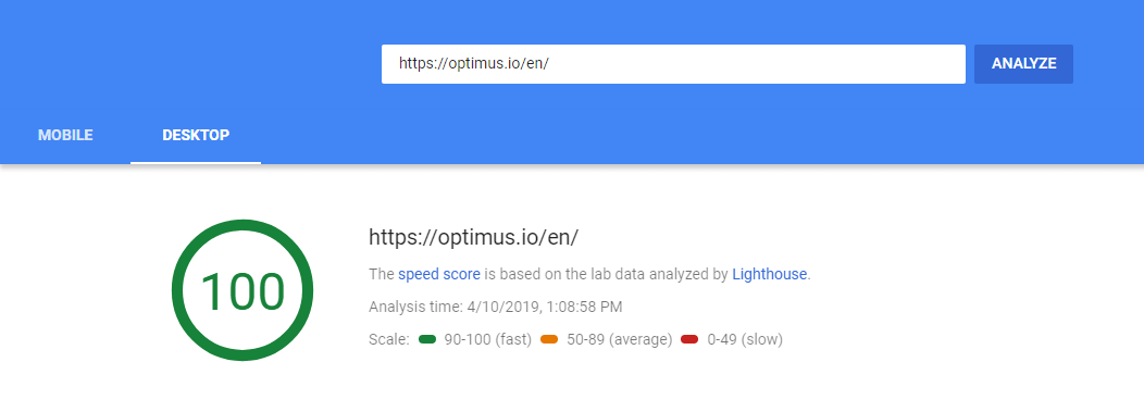
In addition, page load speed also affects rankings in Google and the other search engines.
[Tweet “73% of mobile internet users say that they’ve encountered a website that was too slow to load.” ― Neil Patel”]
#9. Making The User Think
The purpose of a website for a business is primarily to act as a marketing tool. It should explain what you are selling, how much it costs, and how to get it as simply and concisely as possible. The ultimate goal is to convert a web site visitor into a customer as quickly and painlessly as possible.

If, however, a user has to think about the decision or has to work something out for themselves, chances are that they will change their mind and go somewhere else. Make the user experience smooth and seamless for them so they do not have to think for themselves.
#10. Designing For Yourself
A common mistake made by many web designers is to design for themselves without bearing the end user in mind. This can be just self-indulgent, and fail to meet the needs and requirements that the potential visitor to a site will have. Instead, a web designer should work closely with marketing and sales teams to ensure that the design is optimized from a user perspective first of all. And websites should then be tested on actual users and modified according to their feedback.

#11. The Too Empty Empty States
In UI terms an empty state is what a visitor to a website sees when there is no data to display on the screen. This could be for a variety of reasons: a user has just signed up; they have cleared the data themselves, or there has been an error.
An empty state in itself is not a bad thing – they can be used to tell a viewer what it is for, why they are seeing it, and how they can fill it up.
However, they can be frustrating for viewers as well if there is no guidance provided as to what should happen next. That is why it is recommended that they should not be left too empty but filled with an illustration, icon or block of text suggesting the next steps.
#12. Lack Of Typography Hierarchy
In any design project, visual hierarchy is important: It tells people where to look and at what things are on a screen. Hierarchy in typography organizes and gives order to the text elements in a design. It tells the reader what is important, and makes reading much easier. Without it, visitors can get lost or distracted, and either miss key messages or get frustrated and click out of a site.
[Tweet ““Typography needs to be audible. Typography needs to be felt. Typography needs to be experienced.” — Helmut Schmid, Graphic Designer and Typographer”]
#13. Too Much Of Everything
When it comes to web design, sometimes less is better than more. This is especially true of large blocks of text but it can also apply to images as well. If there is too much information to absorb people will not bother to read it. Keep information simple and concise, use images and graphics instead of words where possible, and try not to squeeze too much of either on any one page.

#14. Designing For Too Broad An Audience
Whilst you want your products or services to appeal to as wide an audience as possible, there is a danger that you can make your message too broad, and fail to appeal to any specific group or segment. Before designing your website, research your potential audience, and tailor the material and marketing messages that are likely to appeal directly to them. Tailoring content to a target audience is a much more effective way of marketing and will ensure many more conversions than adopting a random scatter-gun approach.

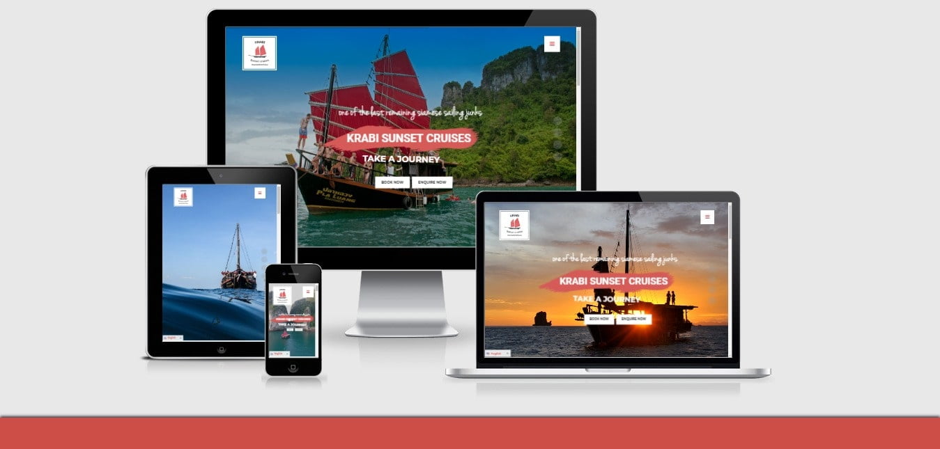
#15. Designing For Only One Screen Size
A common mistake that many web designers make is that they design their websites for full screens only, without checking first if they can be viewed on smaller screens or mobile devices first. This is a huge mistake. Nearly 70% of consumers today consume media or view web pages on their smartphones first, even if they subsequently make their purchases on a laptop or desktop. If your website is not optimized for all screens, then you are potentially jettisoning a large number of potential conversions.
#16. Skipping User Testing
User testing is vital to high conversion rates. Whilst web designers, marketing and sales staff in an organization might have a good idea as to what visitors might want, or how the user experience will be, there is no substitute for getting actual users to test your website and its performance, and to incorporate their feedback.

In fact, user testing should be a continuous process, even when a site has gone live so that the performance of your website is always being optimized.
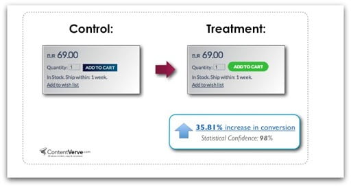
#17. Too Many Pop-ups
Pop-ups work. Research studies have shown that sites that use popups can experience up to a 400% increase in conversions. They are effective because they grab people’s attention, and can deliver key messages in an easily digestible form.
The problem though is they get in the way of designers and prevent them from designing accessible and attractive websites. They take up space and can interfere with page content. However, the main problem with pop-ups is they can be intensely irritating. Many people prefer to read for themselves or to enjoy the user experience without constantly being reminded of these images or prompts.
If pop-ups are to be used they should be used responsibly and sparingly, so they inform visitors without overwhelming or bombarding them.
There is another reason why too many pop-ups should be avoided. From January 2017, Google began to penalize sites that had too many intrusive popups in their global search rankings.
#18. Use Long-Form Copy
A long-form copy is the internet version of an old copywriting tradition and is often used as a marketing tool to try and pressure visitors into buying using techniques like yellow highlighting, cantered red headlines and blinking arrows. It can be successful in certain circumstances, such as selling to cold prospects who need to solve a particular problem, because it highlights the product without any distractions.
However, these techniques are associated with pay-per-click campaigns which are not only more expensive than they once were, but have also caused web visitors to be wary about clicking on then, because of the increased prevalence of malware and viruses on the web, And, most importantly of all, long-form copy is an aggressive form of advertising, and you are likely to alienate more visitors than you attract.
#19. Hard to Read Fonts and Poor Color Contrast
Unfortunately, not everybody has perfect eyesight and is able to distinguish subtle shades and colors. In fact, people with impaired vision have problems reading text that does not contrast with its background. And men, in particular, often suffer from a color deficiency, particularly in distinguishing reds from greens. That means that if you use hard to read fonts or poor color contrasts on your site, you can be making pages hard to read, and will see your page bounce rate start to rise.
#20. User’s Right To Privacy
Websites are constantly asking people to trust them with sensitive, personal information. But, the more that a user is required to reveal, the greater the importance the website designer and owner needs to place on data protection. Therefore, when designing a website or any online form that collects private, proprietary information, companies need to have clear policies and procedures in place as to how user data will be collected and stored. This also needs to be communicated to visitors in the form of a privacy policy and a website’s terms and conditions.
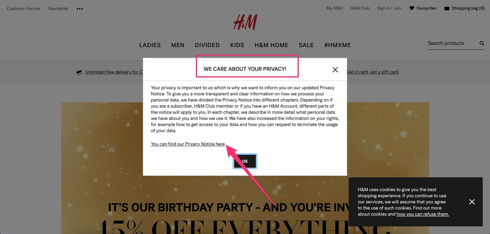
This is not just a legal requirement either. Failure to adhere to their obligations under legislation like GDPR (General Data Protection Regulation) can cost businesses, thousands or even hundreds of thousands of dollars in fines, and criminal charges against company owners.
#21. Providing Too Much Choice
Designing a website with too many options, too many buttons to click or toggles can lead to user paralysis. They do not know what to do next, so often end up doing nothing. The golden principle with website design is that less is more.
Conclusion
It can be difficult to appreciate the value of a well-designed website to your business – until you realize that a site that is poorly designed or does not work well can cost your company or organization heavily when it comes to lost sales and conversions.
That means that your site needs to be clean, attractive, well-laid out and organised, and easy to read and navigate. It also needs to be fast, easy to load, and viewable on all devices or sizes of screen. Bear your target audience in mind, value social proof, and remember the general precept that less is more.
Last but certainly not least, do not assume that once a website and launched that your job is done. Far from it. A website should be constantly evolving, incorporating continuous customer and user feedback to try and ensure it is optimized a far as possible, and that as many clicks and conversions are being achieved.


Leave a Reply