
Table of Contents
When creating a site, it’s energetically suggested that you have a methodology that directs the website composition cycle to productivity and meeting the site objectives. This implies the website design system is lined up with the site correspondence technique: the method of speaking with customers, and the way of sending the organization message to customers ought to be in accordance with the web composition.
At the end of the day, making your site look fine doesn’t, regardless, struggle with the site’s motivation and goals. Web design has changed drastically over the last few years and it’s continuing to evolve. That’s why you have to focus on modern web design principles when designing your new and existing project.
It is a fact that people will spend more time on something they enjoy and it’s important for businesses to keep this trend in mind when creating websites. We’ll make the website design strategy stride by step and tell you the best way to make one and start on a strong premise in building your new site: Here is how it goes.
Table of Contents
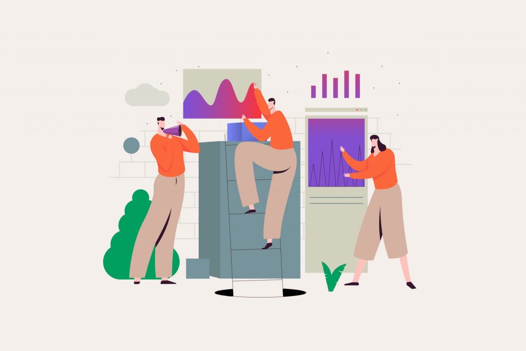
Best website design strategies for building successful websites in 2023
1. Use consistent design elements across your website
Using design elements effectively across a website can improve user experience, increase engagement, and enhance the overall aesthetic of the site. Good design can make a website more visually appealing and easy to navigate, which can lead to increased user satisfaction and longer visit duration. Effective use of design elements can also make a website more memorable and increase the likelihood that users will return. Additionally, a well-designed website can help convey a sense of professionalism and credibility to potential customers or clients.
These are the top branding elements to use on the website:
1. Logo: A clear, recognizable logo is a key element of any brand and should be prominently displayed on the website.
2. Color scheme: Consistent use of a specific color scheme can help to create a strong visual identity for a brand.
3. Typography: The use of specific fonts and font styles can also help to create a unique brand identity.
4. Imagery: Using a consistent style of imagery can help to create a strong visual identity for a brand.
5. Tone of voice: Consistently using a specific tone of voice in all communications, including website copy, can help to establish a brand’s personality.
6. Storytelling: Using storytelling techniques on the website can help to create an emotional connection with the audience and build a strong brand.
7. Consistency: Ensuring that all elements of the website, including layout, design, and content, are consistent can help to establish a strong brand identity.
8. Interactive elements: Using interactive elements such as quizzes, polls, and games can help to increase engagement with the website and the brand.
9. Social proof: Displaying customer testimonials, case studies, and reviews on the website can help to establish credibility and build trust with potential customers.
10. Call to action: Including clear calls to action on the website can help to guide users towards taking specific actions, such as making a purchase or signing up for a newsletter.
2. Get white spacing right
White space, also known as negative space, is the area of a web page that is left blank or unoccupied by any elements. It is the space between text, images, and other design elements on a web page. White space is an important aspect of web design because it can help to create a sense of balance and harmony on a page, making it easier to read and navigate. It can also help to draw attention to specific elements by surrounding them with empty spaces. Additionally, white space can help to create a sense of elegance and professionalism, making a website appear more polished and sophisticated.
Improves readability: White space, also known as negative space, helps to separate text and images, making it easier for viewers to read and understand the content. This is especially important for long-form content, such as articles and blog posts, as it breaks up the text and makes it less overwhelming.
Enhances aesthetics: White space can also be used to create visual interest and balance in a design. It can help to create a sense of harmony and simplicity, making a website look clean and uncluttered.
Draws attention to important elements: By using white space strategically, designers can draw attention to certain elements, such as calls to action or key information. This can help to guide the viewer’s eye and make the content more engaging.
Increases legibility: White space can also help to increase the legibility of text, especially on smaller screens such as mobile devices. By providing ample space around the text, it can make it easier to read, especially for users with visual impairments.
Create hierarchy: White space is also used to create a visual hierarchy, by organizing different elements of the design by size and prominence, making it easier for users to scan and understand the content.
3. Make your website a breeze to navigate
Navigation optimization in web design is the process of designing a website’s navigation system to make it as user-friendly and intuitive as possible. Navigation optimization can help to improve the user experience by making it easy for visitors to find the information they need and complete the tasks they came to the website to do. The process of navigation optimization includes:
1. Organizing content: Group similar content into logical categories and subcategories to make it easy for users to find what they’re looking for.
2. Labeling: Using clear, concise labels for each navigation item to make it easy for users to understand where each link will take them.
3. Placement: Position the navigation in a consistent and prominent location, such as the top or left of the page, to make it easy for users to find.
4. Consistency: Ensuring that the navigation remains consistent throughout the website so that users don’t have to relearn how to navigate the site on different pages.
5. Testing: Continuously testing and evaluating the navigation to ensure that it is meeting the needs of users, and making changes as necessary.
By following these principles, you can optimize the navigation of your website and make it easy for visitors to find what they need and stay on the website, which ultimately leads to increased engagement, user satisfaction, and conversion rate.
Top elements of Website Navigation:
1. Navigation menu: A primary navigation menu is a key element of website navigation, typically located at the top or side of the page, that provides links to the main sections of the website.
2. Drop-down menus: Drop-down menus are a useful way to present subcategories and secondary information, they allow users to access more information without cluttering the navigation menu.
3. Breadcrumb navigation: Breadcrumb navigation is a secondary navigation system that allows users to see the path they took to get to the current page and easily retrace their steps.
4. Search bar: A search bar allows users to quickly find specific information or products on the website.
5. Home button: A clearly labeled and prominent home button allows users to easily return to the main page of the website from any other page.
6. Call-to-Action: A clear and prominent call-to-action (CTA) buttons, such as “Contact Us” or “Shop Now” can help guide users towards taking specific actions.
7. Footer navigation: A footer navigation is a secondary navigation menu located at the bottom of the page that provides links to important pages such as the “About Us” page, “Contact Us” page, and “Terms of Service” page.
8. Mobile optimization: Optimizing the navigation for mobile devices is important to ensure that it is easy to use on smaller screens and with touch-based navigation.
9. Accessibility: Navigation should be designed to be accessible to users with disabilities and should be compliant with web accessibility guidelines.
10. User testing: Regularly testing the navigation with real users can help to identify any problems and make improvements.
4. Make your CTA stand out
Each page on your website should have a purpose. Your visual hierarchy and navigation play a big part in pushing people toward this goal, but your call-to-action (CTA) is where you convince them to take the next step.
Make your CTA design effective:
- Giving it a prominent position on your page
- Using contrasting colors to make it stand out
- Using multiple buttons throughout your page
- Combining your CTA with other elements to make your offer super clear
- Using different CTAs for each page
Top benefits of using CTA:
Increased conversion rates: CTAs can help guide users to take a specific action, such as making a purchase or signing up for a newsletter.
Improved user experience: CTAs can make it clear to users what the next step is, reducing confusion and making it easier for them to complete a desired action.
Better tracking and analytics: By using specific CTAs, you can track which ones are performing well and which ones need to be improved.
Increased sales and revenue: By guiding users to take specific actions, you can increase the chances of them making a purchase or taking some other desired action that will result in increased revenue.
Better targeting: CTAs can be used to target specific groups of users, such as those who have previously shown interest in a particular product or service. This can help to increase the effectiveness of your marketing efforts.
5. Optimize your web design for SEO
As the internet continues to evolve, search engine optimization (SEO) has become an increasingly important aspect of web design. SEO is the process of improving the visibility of a website or a web page in a search engine’s unpaid results. By optimizing your website for SEO, you can improve its visibility in search engine results pages (SERPs), increase traffic to your site, and ultimately drive more conversions. In this article, we will discuss some tips and best practices for optimizing your web design for SEO, including using keyword-rich titles and meta descriptions, optimizing URLs, using header tags correctly, optimizing images, using internal linking, and responsive design. With these tips and best practices, you can improve your site’s SEO during the web design process to increase its chances of ranking well in SERPs.
Best practices to keep your design SEO friendly:
Search engine optimization (SEO) is a critical aspect of web design. By optimizing your website for SEO, you can improve its visibility in search engine results pages (SERPs), increase traffic to your site, and ultimately drive more conversions. Here are some tips for optimizing your web design for SEO:
Use keyword-rich titles and meta descriptions: The title and meta description of your website are the first things that users see when your site appears in SERPs. These tags should be keyword-rich and accurately describe the content of your site. Use keywords that are relevant to your business and that your target audience is likely to use when searching for your products or services.
1. Optimize your URLs: Use clear and concise URLs that include your keywords. This makes it easier for both users and search engines to understand the content of your site and can help to improve your site’s visibility in SERPs.
2. Use header tags correctly: Header tags (H1, H2, H3, etc.) help to organize your content and make it easier for users to scan and understand. Use them correctly and include your keywords in these tags to help search engines understand the structure of your site and improve your site’s visibility in SERPs.
3. Optimize images: Use descriptive, keyword-rich file names for your images and include alt tags that describe the image. This will help search engines understand the content of your images and improve your site’s visibility in SERPs.
4. Use internal linking: Linking to other pages on your site can help to improve the visibility of those pages in SERPs and make it easier for users to navigate your site. Use keyword-rich anchor text when linking to other pages on your site.
5. Use Social Media Integration: Social media integration is becoming increasingly important for SEO. By integrating social media into your website, you can increase your visibility in SERPs and drive more traffic to your site. Use a social media sharing buttons on your site and include links to your social media profiles in your site’s footer.
6. Use responsive design: With more and more users accessing the internet from mobile devices, it’s essential to have a responsive web design. A responsive design will ensure that your site looks great on any device and that it is accessible to all users. This will also help you to improve your site’s visibility in SERPs as search engines are now ranking mobile-friendly sites higher.
7. Optimize for page speed: Page speed is an important factor for SEO. Users are more likely to bounce from a site that takes too long to load. Optimize images, minify code, and use a content delivery network (CDN) to improve your site’s page speed and help to improve your site’s visibility in SERPs.
In conclusion, optimizing your web design for SEO is essential if you want to improve your site’s visibility in SERPs, increase traffic to your site, and ultimately drive more conversions. By following the tips outlined in this article, you can improve your site’s SEO and increase its chances of ranking well in SERPs. However, it’s important to keep in mind that SEO is a constantly evolving process, so it’s essential to stay up-to-date with the latest best practices and trends to ensure that your site remains optimized for SEO.
6. Keep improving by A/B testing
A/B testing is a powerful technique that can help you to optimize your web design and improve conversions. By running A/B tests, you can compare two different versions of a web page, one with a slight change, to see which version performs better. This allows you to test different elements of your web design, such as headlines, images, and call-to-action buttons, and determine which elements are most effective at driving conversions.
Keep improving A/B testing can help in web design by:
Identifying problem areas: By testing different versions of a web page, you can identify areas of your site that are underperforming and make improvements to those areas.
Increasing conversions: By testing different elements of your web design, you can identify which elements are most effective at driving conversions and optimize your site accordingly.
Improving user experience: By testing different versions of a web page, you can identify which version provides the best user experience and make improvements to your site accordingly.
Making data-driven decisions: A/B testing allows you to make decisions based on data, rather than assumptions. By testing different versions of a web page, you can see which version performs better and make improvements to your site accordingly.
Continual optimization: By regularly running A/B tests, you can continually optimize your web design and improve conversions over time.
It’s important to keep in mind that A/B testing is an ongoing process and it’s important to run multiple tests to get a clear picture of what works and what doesn’t work on your website, and also to have a clear hypothesis and a measurable goal. Also, it’s important to note that A/B testing is not a one-time process but a continuous process of testing, analyzing, and optimizing the website.
7. Parallax Scrolling
Parallax scrolling is a technique in web design where the background and foreground elements of a website move at different speeds when the user scrolls. This creates a sense of depth and movement on the web page, and can be used to create immersive and interactive experiences for users.
There are two main types of parallax scrolling:
Horizontal parallax scrolling: In this type of parallax scrolling, the background elements move at a slower speed than the foreground elements when the user scrolls. This creates a sense of depth and movement as the background elements appear to be further away.
Vertical parallax scrolling: In this type of parallax scrolling, the background and foreground elements move at different speeds in the vertical direction. This creates a sense of movement and depth as the elements appear to be moving closer or further away as the user scrolls.
The main goal of parallax scrolling is to create a more engaging and interactive experience for the user by adding a sense of depth and movement to the webpage. Parallax scrolling can be used to create a variety of effects, from subtle animations to full-page scenes.
One of the main benefits of parallax scrolling is that it can help to grab the user’s attention and make the website more engaging. It can also be used to guide the user’s attention to specific elements of the webpage, such as calls to action or important information.
Parallax scrolling can be created using a variety of techniques, including JavaScript, CSS, and HTML. It can also be used in conjunction with other web design techniques, such as responsive design, to create a seamless user experience across different devices.
However, it’s important to keep in mind that Parallax Scrolling can have a negative impact on website performance, particularly on mobile devices with limited resources, also it can cause accessibility issues for some users. Therefore, it’s important to use it with caution and consider the user experience, performance, and accessibility.
In conclusion, Parallax Scrolling is a powerful technique in web design that can be used to create immersive and interactive experiences for users. It can be used to grab the user’s attention, guide their focus and make the website more engaging. However, it should be used with caution and consideration of the user experience, performance, and accessibility.
8. Animated Cursors
Animated cursors are a type of web design feature that allows the cursor on a website to be customized and animated. This can be used to create a more engaging and interactive experience for users, and can also be used to guide the user’s attention to specific elements of the webpage.
Animated cursors can be created using a variety of techniques, including CSS and JavaScript. Some popular libraries and frameworks such as animate.css, and animate.js are also available which makes it easy to create and implement animated cursors.
Animated cursors can be used to create a variety of effects, such as:
1. Custom cursor shapes: Custom cursor shapes can be used to create a more engaging and interactive experience for users. For example, a cursor can be designed to look like a hand or a pointer, making it easier for users to understand the purpose of the cursor.
2. Hover effects: Hover effects can be created by animating the cursor when it has hovered over a specific element on the webpage. This can be used to guide the user’s attention to specific elements of the webpage, such as calls to action or important information.
3. Loading animations: Animated cursors can be used to indicate that a webpage is loading, which can be a more engaging and interactive way of indicating that a webpage is loading than a traditional loading spinner.
4. Interactivity: Animated cursors can be used to create interactive experiences for users, such as allowing the user to control elements on the webpage using their cursor.
5. Customizing cursor for different sections of the website: Animated cursors can be used to provide different cursor styles for different sections of the website, this can be used to make the website more engaging and interactive.
It’s important to note that animated cursors can have a negative impact on website performance, particularly on mobile devices with limited resources and also it can cause accessibility issues for some users. Therefore, it’s important to use it with caution and consider the user experience, performance, and accessibility.
In conclusion, animated cursors are a powerful web design feature that can be used to create a more engaging and interactive experience for users. They can be used to guide the user’s attention to specific elements of the webpage, create hover effects, loading animations, interactive experiences, and customized cursor for different sections of the website. However, it should be used with caution and consideration of the user experience, performance, and accessibility.
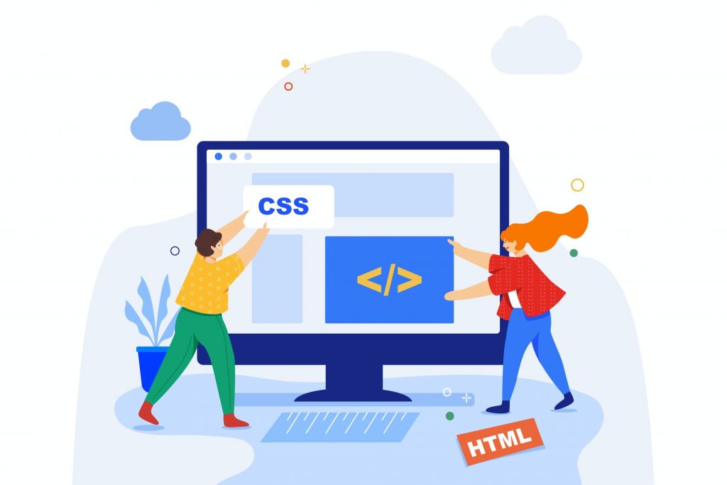
9. Clean CSS
Clean CSS can improve the performance of a website, which can have a positive effect on SEO. A website that loads quickly and is easy to navigate can improve user experience, which can lead to higher engagement and a lower bounce rate. This can signal to search engines that the website is valuable and relevant, which can lead to higher rankings in search results. Additionally, clean and organized CSS can make it easier for search engines to crawl and index a website, which can also improve SEO.
1. Faster loading times: Clean CSS can help reduce the size of a website’s code, which can lead to faster loading times. This can improve user experience and lower bounce rates, which can be beneficial for SEO.
2. Improved crawlability: Search engines use spiders or bots to crawl and index websites. Clean CSS can make it easier for these bots to navigate and understand a website, which can improve crawlability and indexing.
3. Better user experience: Clean CSS can make a website easier to navigate and understand, which can improve user experience. This can lead to lower bounce rates and higher engagement, which can be beneficial for SEO.
4. Easier to maintain and update: Clean CSS can make it easier to maintain and update a website. This can be beneficial for SEO because it can allow for faster implementation of changes and updates that may improve the website’s visibility and rank in search results.
5. Better accessibility: Clean CSS can improve the accessibility of a website. This can help make the website more inclusive for all users and can be beneficial for SEO as it can help increase the reach of the website.
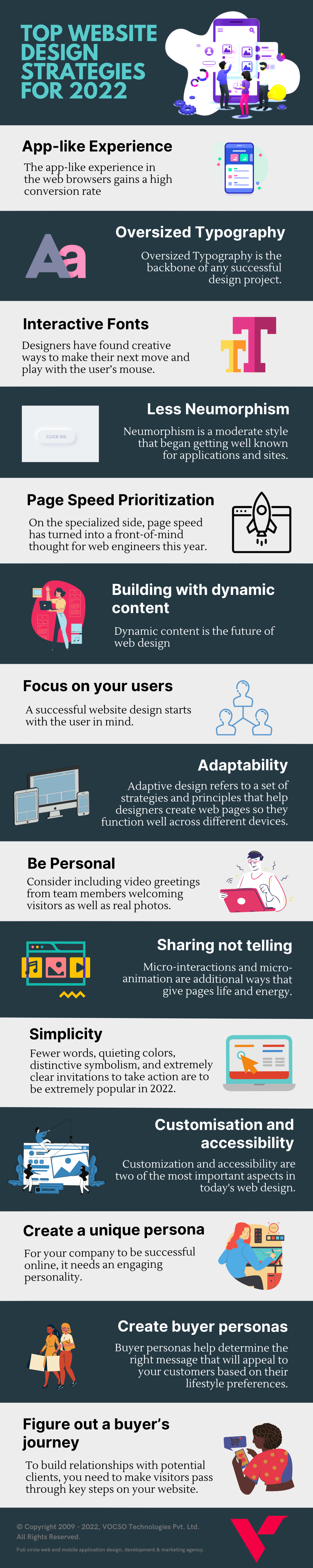
10. App-like Experience

When it comes to web design, designers are increasingly focused on the front-end experience. This means that user interfaces with animations and dynamic features can provide users an app-like interface – something they’ve been accustomed to in recent years as apps have become more popular among consumers looking for unique experiences outside of their phones or computers. A new way of using websites has emerged which is both exciting yet challenging because it isn’t much precedent-related towards this type at all.
As people become habituated to the dynamic experiences of modern apps, we can expect them to also be looking for websites that offer these features. This is why it’s important now more than ever before in web design today if you want your site to stand out from its competitors.
11. Oversized Typography
Oversized Typography is the backbone of any successful design project. Whether it’s simple or complex, typographic elements make up most parts of your designs and can be used in many different ways to suit whatever you are designing for! This year we’ve seen an increase in unusual-sized words which work well when they’re not too big so as not to take over everything else around them – these would include minimalistic styles but also maximalist ones if done right.
Typography in web design can make or break a website. The right typefaces and layouts are key to creating an engaging, creative experience for users on the web that makes them eager to come back again!
12. Interactive Fonts

Designers have found creative ways to make their next move and play with the user’s mouse. An easy way is by applying a hover-state change like you would with buttons, which helps because now it’s easier than ever before! Designing for interactivity onto fonts requires some care so as not to distract from legibility but clever design can create more elaborate effects without having any coding knowledge whatsoever all while keeping audiences engaged through animation or other techniques.
A designer should keep these points in mind when adding life into words on the screen: Make sure there isn’t anything blocking what they’re trying.
13. Less Neumorphism
Neumorphism, another understanding of skeuomorphism in the plan, is a moderate style that began getting well known for applications and sites. It replicates the current gadget plan by utilizing low differentiation monochrome components, subtle shadows, and renouncing lines and sharp borders.
The absence of difference and clear separation makes navigation in this style exceptionally difficult to explore for anybody with diminished vision, and the shadowed components make it difficult for the client to tell which button they are pressing. Everybody will experience situational vision troubles sooner or later, as bright conditions that disrupt screen permeability, and neumorphism is difficult to peruse in conditions like that.
Since everybody encounters situational incapacities eventually on schedule. Availability is substantially more than a pattern – it is a need and ought to forever be a top thought when planning for Web Design.
14. Page Speed Prioritization
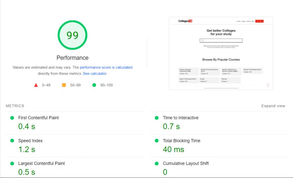
On the specialized side, page speed has turned into a front-of-mind thought for web engineers this year. Google’s 2022 calculation update makes speed a more significant thought than before for SEO. This likewise mirrors the client’s high standards for site speed execution since many clients will leave a page that requires over 3 seconds to stack. Gone are the times of calmly looking out for loading screens.
Google PageSpeed Insights or Lighthouse are devices that can be utilized to evaluate your page speed improvement. There are additionally a couple of basic steps developers can take to ensure pages load rapidly like picture streamlining and conceded offscreen picture stacking. Restricting the number of textual styles you are utilizing can help too. You additionally need to try not to foster your pages on a stage that depends too intensely on modules since that can have a major effect.
15. Building with dynamic content
The process of designing a website has changed significantly over time due to the introduction and adoption by developers with no-code platforms. Designers can now build faster with more complexity without increasing labor hours, which is efficient for both them as well as businesses who want their sites designed quickly without compromising quality standards.
Dynamic content is the future of web design. With one place to change a structure, you can simultaneously update all your blog posts or even eCommerce sites without having any manual adjustments! This makes it perfect for constantly changing topics like blogs and portfolios that need fresh material added into them regularly.
16. Focus on your users

While numerous things in the realm of website Design and Marketing appear to change, for the time being, this one endures for the long haul. Before you put anything on the web, it should be verified from the perspective of your target audience.
This is particularly pivotal as you center all the more eagerly around your Digital presence. At the point when you know everything about your ideal client, you have an unusual feeling of the data guests need to find when they come to your webpage, and can make a site methodology that makes this data open. You’ll likewise have the option to promptly respond to normal inquiries for first-time guests or imminent clients – passing on them with more opportunities to spend on a different region of your site.
A successful website design starts with the user in mind. This is the reason you need to understand the user in web design. The best way to ensure that your site is readable, efficient, and easy to navigate for all users? Make sure you ask them! This means getting input from people who will be using it regularly.
If you’re not aware of how to design the user experience (UX) then these reputed UX/UI design tools can help you to turn your website data into actionable.
17. Adaptability

Adaptive design refers to a set of strategies and principles that help designers create web pages so they function well across different devices. Websites are constantly changing, so it’s important that they’re adaptable. People use different devices and computer programs to view the website – for example, some may prefer reading on an e-reader or tablet while others like using their desktop browser as well other options such as mirrors connecting over wifi hotspots, etc. The design should be able t recognize these individual preferences without compromising any functionality of how you want your site seen by everyone visiting it.
These are the reasons why responsive web design is important for your website. Responsive design allows you to easily and quickly adapt the site’s content, look & feel across any device. This means that people are more likely to visit our sites than those without responsive capabilities – not only do they get an optimized user experience but also benefit from enhanced search engine rankings!
18. Be Personal

In order to remain competitive in today’s marketplace, you must focus on your digital presence. This doesn’t mean forgetting about the people aspect of the business; rather than just having a website with content and no interactivity or social media posts where all there’s left for customers/prospects are their questions asked by other users online–it might be worth investing time into making someone feel welcome when they arrive at your page.
Consider including video greetings from team members welcoming visitors as well real photos which allow potential consumers to know who has created this product (you) alongside images representing each member involved within said company.
19. Sharing not telling
In 2022, you’ll see more videos and movements that draw in your guest’s psyche and will add delicate movement to your page, decline the bounce rate, and assist guests with connecting with the words and telling.
Micro-interactions and micro-animation are additional ways that give pages life and energy. Making them inconspicuous, yet perceptible adds a degree of detail that your guests will most likely be unable to express, however, that assists you with sticking out.
What is micro-interaction? Consider them little liveliness that gets set off by drifting with your cursor, or by looking at a specific piece of the page. At the point when you drift the mouse over the button or a segment of the site and something changes tone, or a symbol moves somewhat, that draws in you outwardly and gives the page a material inclination.
Animations are particularly valuable for delineating complex ideas and cycles in a straightforward, edible way. While it very well may be abused, basic and refined liveliness outline your message in a manner words never could.
20. Simplicity
Businesses are going through genuine difficulties going into 2022. Making barriers to client commitment is not an achievable methodology when your business is hoping to develop. How does that convert into website design?
Fewer words, quieting colors, distinctive symbolism, and extremely clear invitations to take action are to be extremely popular in 2022. Page configuration will drift toward lighter-weight encounters that urge the client to investigate further, rather than putting everything front and center on one page. They’ll be improved on informing that appeals the guest to need to find out more, rather than complex discussions that leave guests feeling data over-burden.
While a couple of years prior the pattern was toward things like infographics – firmly planned, typography-driven, space consolidated – plan in 2022 will join more space and delicate movement. This allows you to pass on data – however in a manner that uncovers and grows, rather than being so consolidated and overpowering.
Web structures are probably going to get a more straightforward and lighter load to try not to lose the likely lead to a series of inquiries. Two or three inquiries dispersed north of a couple of associations is ending up a more effective strategy for connecting new leads than putting one major structure up – and it’s more straightforward to draw in with on cell phones too.
21. Customisation and accessibility
Web design has long had a reputation for being difficult to access, but as technology continuously evolves and new accommodations are created we must also consider those who may be visually or hearing impaired. New practices like mobile-first indexing were introduced several years ago in an effort from Google towards better customer experience; these principles can help make your website more inclusive while keeping security considerations top of mind throughout the development process too.
The design and implementation of these features tell your customer that you’re thinking about their needs, desires, or preferences. This shows in the way they are given access to information on your site through fonts customized for dark mode operations as well as screen readers which enable them to see what’s going on without having difficulty viewing it due solely because there wasn’t enough contrast between text colors/font styles compared with background images all this makes an important difference when someone visits any page.
Web design is more than just creating pretty websites; it’s also an opportunity for you to really connect with your customers on their level. A custom web presence will allow people access to what makes up who we are as individuals while providing them with valuable information they need or want in order to do business together! Custom web design has the potential to be one of your company’s most valuable assets.
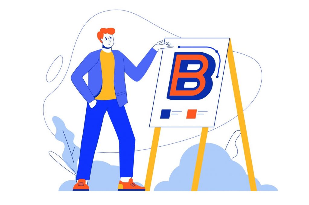
22. Create a unique persona representing your brand
For your company to be successful online, it needs an engaging personality. You must create a seller persona that is defined by specific traits and integrates colors into its image as well the use of certain moods or emotions on websites to build trust with potential customers who may have doubts due to their product not being genuine because they didn’t know where it came from originally.
A clear example would include how many businesses today just put up any old picture without even thinking about what kind of marketing strategy could work best given these different personalities-but this doesn’t mean you should reinvent the wheel! Instead, find out more information first hand then update accordingly so all aspects match perfectly including branding guidelines too.
23. Create buyer personas to be strategic
Buyer personas help determine the right message that will appeal to your customers based on their lifestyle preferences. For example, if you’re targeting people with a high income who live alone or have children outside of marriage then it’s important for them not only to see ads about mortgage loans but also those types of investments because these topics may be more interesting than others which have less relevance or applicability for this particular group.
Buyer persona helps marketers target specific audiences by identifying key differences between buyers within each demographic category so as not to leave any potential customer overlooked
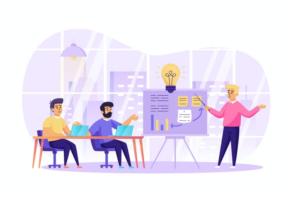
24. Figure out a buyer’s journey, within your web design strategy

To build relationships with potential clients, you need to make visitors pass through key steps on your website. This takes the form of a buyer journey and accompanies their decision-making process as they research what it is that will actually satisfy them once the purchase has been made
An example customer framework called AIDA can be used when designing websites or promotional materials; however there are other models out there depending upon how complex your business may seem – but whatever method is employed keep in mind all communication points must engage users so we see conversions happen.
25. Study the competition

Identifying and understanding your competitors is essential to success. Without knowing what they’re doing well, how can you hope to stand out in a crowded marketplace? You need all of this information so that when people visit your website or look at ads on other sites like Google Ads (or even Facebook), there will be something familiar about them-and thus encouraging more traffic from those sources than would otherwise occur.
It’s important to study the competition because it can have some advantages. For example, It allows you to rely on previous research competitors made about what works well and doesn’t work in your favor; discovering their flaws so that they are not able to do anything like this again next time around., Which means learning from them too! That way we know exactly where our strengths lie- which will help us avoid making mistakes or taking unnecessary risks while developing a product/service idea – all things considered leading towards success.
26. Fundamental for your website design strategy
Your goal should be clear from the beginning, so you know what’s right. One way to make sure it aligns with your business strategy and achieves its potential is by setting key performance indicators (KPIs). KPIs help stakeholders understand if they are achieving their desired result as well as identify any gaps or weaknesses in the process that need attention before goals can become fully realized
The best indicator for success might not always come immediately when looking at analytics software alone; sometimes all we need is someone else who knows more about our industry than ourselves to point out where things could go better.
27. Integrate your brand strategy
When establishing the brand, it’s important to answer these questions: What is your mission? Which one do you want people asking of yours when they hear about or see this product/service for themselves – its Unique Selling Proposition (USP)? How would we be able to recognize that our company has successfully communicated its value proposition in a way others can’t ignore?”
“It starts by correctly defining each word within our communication strategy so there are no misunderstandings along the way. There needs more than just good ideas; instead, something meaningful should come from them.”
28. Strategically design the structure of information on each website page
When designing a website, you should know how to structure information on each page. The goal is for the reader’s experience on your site and make it interesting with good content that they would want more of or read through fully without feeling like there were too many distractions from what was being said in order to maximize their attention span while reading posts/pages etc., which could lead them coming back time after again because this person has something worth seeing first hand!
An example might include using headings (h1-6), bolded words if important points are emphasized; underlining key phrases within paragraphs where extra emphasis is needed such as quotes by experts.
29. Place one, or better, two CTAs on each landing page
Having a clear call-to-action (CTA) button is one of the most important elements of your website. It’s the part of your website that you want your visitors to interact with, and if it’s unclear what they should do next, it can mean you’re losing potential conversions every day.
Treat your CTA button like an advertisement; because that is what it is. Think about where on your page you would place a big advertisement and then place your CTA button there. The main thing to remember is to have one CTA button at the top of the page and another one at the bottom.* This way you can test which CTA works best for you, so maybe you find out that putting a CTA button at the top gives you more sales than one at the bottom.
When designing your website, make sure you have a clear call-to-action (CTA) button that conveys a strong action message in plain language. Avoid using any vague or ambiguous language in your CTAs and make sure to include only one primary CTA per page. This will help users understand exactly what action they should take next when visiting your site.
Top Website Design Strategies – Infographic
Conclusion
The web design strategy should include a plan for your website. This will help you to create and develop it in an efficient manner, which is crucial when we’re talking about such things as designing websites with clear objectives or connecting the dots between plans/websites themselves – because without this latter aspect there would be no way of knowing whether everything has gone according to what was desired from start (which can’t happen if something isn’t complemented properly)


Leave a Reply