

Table of Contents
Of the plethora of sites out there, formulating an effective one can be a tedious task. Remember that consumers invest their time in shopping/ordering on eCommerce sites, learning, education, and of course, leisure. Hence it’s easy to repel someone who unsuspectingly lands on a poorly designed site. Now’s the time to implement sustainable principles to either revise or create a great site. Here we’ll explore modern web design principles.
Web design is a creative art but does follow some guidelines for ideal outcomes. For your online business to succeed, you need a well designed website. A site that is navigable, visually appealing, accessible and provide relevant information. Designing a website might be a bit trickier due to several web design options. However, we often overlook modern web design principles thus ending up with poor designs. Here are the top web design principles that will make your site easier to use, engaging, attractive and more effective. Let’s see what we need to do to achieve this…
Table of Contents
#1. What are you trying to achieve?

A site’s message and calls to action (CTAs) are imperative to fulfilling your overall objective. Your purpose could be anything from marketing purchases, sharing your background or training. Grab people’s attention with a catchy phrase or in a couple of sentences – what exactly you do. This process isn’t spontaneous but rather should be coherently planned according to your cause. A methodical set of the material then ensues. You can reaffirm this by calculating your target audience, analyzing the requisite information, and how you will present this. Understanding demographics and rebuttals will guide your site creation.
Particular marketing tactics can help you to outperform your rivals, whilst your design has a broad meaning. Delivering visually appealing and engaging content will project your site in a shining light. This collectively garners further visitors and adds value to your brand! This is what is referred to as web design principles.
#2. Content conveys meaning

Your written content and the overall material framework should actually add value to your site. It should complement your brand and comprise of natural language that is both compelling as well as comprehensible. It should be logical yet succinct. Fidelity prose would encourage guided CTAs along with thorough SEO implementation. Write in a conversational manner with keywords to inform your audience of something meaningful. Apply real content right from the outset for a better understanding to remain focused throughout the process.
#3. Visuals maintain engagement

All aspects of design need to imbibe and present your brand’s image. Be it imagery in the form of pictures, graphics, or even videos, these all moderate the remaining text content. These pauses help the viewer’s eyes to literally breathe, instead of being swamped with continuous and increasingly monotonous prose. A figurative or idealistic image is a great way to begin, whilst animated transitions and scroll activated effects draw interest and curiosity to continue browsing. By increasing the retention rate, the accessibility of every webpage can be fully exploited to one’s advantage, promoting an interactive experience.
Irrespective of a brand’s style, visuals should vitalize your design and make their occupancy worthwhile. Virtually any type of business domain can become creative with these whilst still remaining relevant. Just remember that these should be of high fidelity and presentable (imbibing good web design principles). Deploying crisp, sharp resolution color friendly pics that are appropriately scaled always makes a winning combination for customers.
#4. Synchronous designs shine

All aspects of your outlay should be harmonized, including HTML and CSS coding. Synergistic designs in terms of size, shape, and location all unify a common cause. This promotes user experience, as even one inconsistency can throw anyone off, rendering all your other efforts in vain. Neither do you want visitors to bounce, upsetting the likelihood of a higher Google ranking?
An ideal designer creates ergonomic features and applies engaging fonts, visuals, and navigation pathways. These are all then synergized yet balanced out to avoid overwhelming audiences and retain focus on the main point.
Accessibility and weightage of each element are both important aspects for any well-created site, along with the general theme. Effective web design principles help to synchronize all elements, producing a unified masterpiece. Brand guideline and a living style guide both formulate an explanatory content cum visual experience, interwoven with configurable and instant modifications.
#5. Typography outlines impression
Typography channelizes your thoughts by the words, character styles, and shapes. It conveys a deeper meaning visually. Fonts need to fit both the application and tone of the design. Cursive typefaces are apt for headings or decorative purposes, however unsuitable for voluminous text.
Inappropriate fonts can undervalue significant content – especially when factual, as tone of voice does matter! Design can either be conventional or personified. Longer reads usually benefit from the former standard style, whereas the latter should be applied carefully, if not sparingly. The point is that your text should always remain readable, regardless of which font you may use. For a great website, you need a great website UI. And to build a great website UI you need the best fonts. Therefore use tattoo fonts to make your website more attractive.
#6. Organise to unify
Content should be coherent and categorized, leading your readers to an established summary, following sequentially. This is just one of many best web design principles. Every sentence needs to expand upon your brand and objective to keep everyone engaged. Header tags require applying to organize content and assist web crawlers in ranking your site for web searches. In case you don’t have all the finalized content prior to incepting a design, you can still deploy headers as scaffolding for your creation. This also applies to visual elements by defining sections with images and graphics which support the existing written content.
#7. White space balances
White space, buttons, and other visual design elements all help images and content be highlighted and maintain effectiveness (almost akin to virtual punctuation). This is also referred to as ‘negative space’ and forms an imperative element of any functional design. Don’t forget what are the web design principles and how their implementation can improve your site. Your writing can really become convoluted without this.
#8. Visual prioritization makes accessibility a breeze
The visual hierarchy of your site’s navigation should enable you to access your content easily. Obviously, no content should be overlooked, however relentless dropdown menu bars, buttons, and internal links will perplex people. Your site section routes and content should be succinct and convenient to operate. These are just some of the design principles for websites. Sometimes fewer choices are best!
#9. Be honest
Some brands operate on this one principle only – just project what your product or service really is (what you see is what you get). This is empowering in itself. Be authentic and include real material plus reviews, otherwise, consumers will see through it and leave. Integrity carries much value and is sadly underrated.
#10. Responsive design
This underpins the fundamentals of site creation which should be compatible with any device (be it a fixed or mobile type) – regardless of the display size. This extensive support with all aspect ratios (height/width) is imperative, especially with increased smartphone use and subsequent access. With the advent of mobile browsing, you must take the onus to deliver a site that caters to this need. It should be brand hardware and OS agnostic to fulfill the needs of every user. Why should any demographic be marginalized or disadvantaged this way?
Aspects include:
- Image optimization
- Make buttons clickable on smaller screens for better ergonomics
- Design multiple prototypes
- Try prioritizing a mobile-based foundation as a framework to build upon
For ideal designs, why not try this modular approach:
Understand →Explore →Prototype →Evaluate
In order to work upon a mobile dedicated protocol, fulfill the following:
- Compressing material and highlighting imperative info on the screen
- Suitable font size
- Improved interactive elements
- Valuing customers by expressing your desire for them
- Client Squish Media (maintain aspect ratio during creation)
An exemplary responsive mobile design application is Towards Data Science.
#11. Ergonomic UI
A user interface is what the user interacts with the system – the skin that they see and feel. It connects the system to the user. A well-designed UI promotes further engagement, retention, revisits, and of course, duration spent. It’s the designer’s responsibility to vitalize this outlay and keep it simple. Here’s some guidance on how to achieve this:
- Make use of all space well
- Apply stable fonts and color
- Eliminate redundant content
- Refrain from relentless sequential information
In order to make something intuitive, relate it to users’ own experiences. Analogical design along with these questions prior to doing so will help:
- Who is going to be the users?
- What type of work will you be doing?
- Where (at which stage) will the interaction take place?
You need to optimize the interactions which users have with their product, to correspond with their activities and requirements. For instance, Google’s conventional Gmail has a robust design enabling you to distantly identify each function as per a denoted symbol (rather than text headings or tags). Hence you can do the same for your site too.
#12. Performance: lightning responsive
Be smart and implement a seamlessly quick site to preserve subscribers. Use the commercially available tools to gauge your site speed, such as Pingdom Tools. Prior to updating, you can precisely isolate any snags (perhaps a specific page or section) and remedy them according to the results returned. Performance boosting techniques include:
- File compression and image optimization
- Use text as a substitute rather than excessive imagery
- Minimize HTTP requests
#13. Refrain from unnecessary ‘Alert/Dialogues’
Never inundate users with pointless dialogues in response to executing any site action (e.g. assuming that a visitor is attempting to make a payment). Only display such notifications when there’s an actual (un)successful transaction made. Avoid during the input of payment details and solely focus to inform or alert them upon a result. It’s ideal to seek their consent actually before doing so with any message.
Be mindful of:
- Only include relevant info in an alert to make it worthwhile & otherwise remove them when not required
- Don’t spam users with such alerts or effectively trap them within a loop
#14. Try to mitigate 404 or 500 errorr
Upon designing a site, do so with all pages, features, and functionality. This avoids having broken links and images, incomplete features, and much more. In particular, the site shouldn’t have any 404 or 500 errors and any broken links should have a decent 404 page. Obviously, try to avoid this occurrence at all costs, however, this will at least offset any damage (somewhat). GitHub’s site for instance is ideal with its animated and apologetic 404s.
Design pages in a manner that despite the user landing on a 404 error page, they need to navigate and return to the homepage, for instance. Providing them alternative options is the best way out.
#15. Mobile friendly
Nowadays, sites can be accessed from multiple devices and displayed using multiple screen sizes, hence mobile optimization and ergonomics are key. You’ll need to redesign your site with a responsive layout (for auto adjustment to various screen widths). Alternatively, build a dedicated mobile site that is independent of the desktop version and solely optimized for mobile devices.
#16. Place Calls To Action Where Visitors Can Easily View Them
Mobile users can easily overlook menu items, therefore, place calls-to-action keys strategically where they can easily see them. When users get to your site, they normally have a specific task to accomplish. They can have easier time completing tasks on websites that display calls-to-action keys (such as make payment, find an agent or log in) in the main body. Minor tasks can be accessed via menus.
#17. Avoid Long Menus
A long menu might work well for desktop sites, however mobile phone users may lack the patience to go through a broad list of options to find what they are looking for. Make it sweet and short as possible.
#18. It Should Be Easier To Return to Home Page
When visitors navigate through a website, they need an easy way to get back to the home page. For instance, they may want to start a new browse session or get back to perform another search. You should make it possible for visitors to be redirected back to the home page when they tap the logo at the top of the webpage.
#19. Do not Let Advertisement Steal The Show
Too many ads and promotions can be a nuisance. They can overshadow the web content they are adjacent to, and make it difficult for customers to accomplish tasks. For instance a larger advertisement banner can distract users and even make them miss navigational keys, thus making it difficult for them to access other services. You can use easily dismissible advertisement banners so as not distract visitors from the experience.
#20. Make Site Search Bar Visible
Users looking for particular information normally turn to search bar – so search bar should be clearly visible. You should position the search bar at the top of your home page.
#21. Website Search Results Should Be Relevant or Guide Potential Client To Better Website Search Results
Search results should be relevant, providing clients with the best solution so they don’t have to browse through several pages in order to find what they looking for. Make life easier for visitors by offering modern smart-search features like a spelling checker, autocomplete, and providing related matches and suggesting search terms.
For websites that serve diverse client segments, it is good to ask a visitor a few questions before they perform searches to make sure they get results from the great content segment. For instance, a large clothe retailer can allow users to begin their searches by having them select the gender and size of clothe they are looking for.
#22. Use Filters to Help Users Narrow down Their Results
Many visitors relied on filters to perform search and actually leave sites that don’t reduce volume. Therefore, consider providing users with easy to use filters to assist them get relevant results within a short period of time. In addition, don’t bury the filter at the bottom of the web page. Users don’t have to scroll down to the end of the search results before they can filter again.
#23. Reduce The Loading Time
No one likes sites that take longer time to load. You can make your web pages load faster by optimizing image sizes, combining code into a JavaScript file or using central CSS (this minimizes HTTP requests thus speeding up load time.
#24. Make it user friendly
Nowadays people are accessing sites using multiple devices with different screen sizes, so it is vital to make you site friendly to search devices. If your site is not friendly to search devices, you can either rebuild it using a responsive layout (this one of the most current web design principles) so as to make it adjustable to different screen sizes or build a dedicated mobile website (a separate mobile site optimized particular for mobile clients).
Navigating the site should be easier. This is what allows users to quickly view additional information such as pages or links without getting lost or frustrated.
#25. Choose Right Colours
Make sure that the colour combination you pick are pleasant to look at. Proper use of colours improve the user experience. Some colour can strain users’ eyes thus making it harder for them to navigate. Contrasting colours are good for the body text and background because they make reading much easier. Complementary ones create a perfect balance. Vibrant colours are discourage because they create emotion, however they can be used sparingly (e.g. for call to actions buttons). White space is effective at giving a site an uncluttered look.
As a general principle, you should avoid placing light colored text on dark background. You website background’s color should be a bit lighter than text to so as to make it more readable.
In addition, use the right font size and style. Select text and font size that is easily readable. A site with unreadable texts and poor colour combination discourage users from returning.
#26. Use high quality images
Selecting the right photos for your site is handy when it comes to brand positioning and enticing your target audience. You can consider buying high-quality professional images or using tools like Wepik to create custom designs to enhance the appearance of your site. Also consider using videos, graphics and info-graphics, as these are more effective at communicating.
#27. Incorporate social media widgets
Use social media widgets to connect your website to more users. Allowing access via Twitter, Facebook, Instagram, and other social media platform give visitors more options for accessing your website.
Developing and designing an efficient site needs a lot more than just information gathering. It should be easily accessible, visually appealing, engaging and easier to use. The application of Web design Principles by a professional web designer can resolve several issues that are obstacles to the success of your online business.
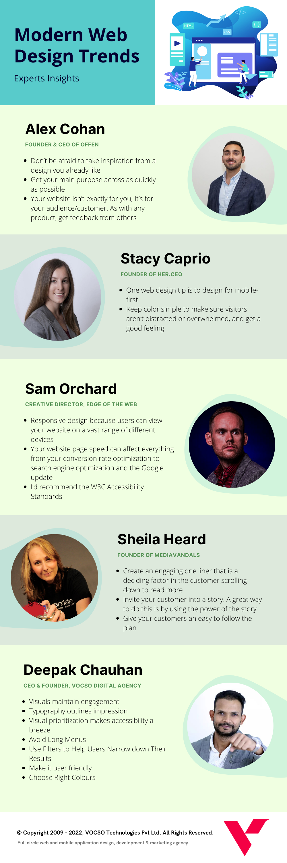
Experts insights on modern web design trends and strategies

Alex Cohan
Founder & CEO of Offen
Don’t be afraid to take inspiration from a design you already like
There’s certainly a line between being inspired and copying, but taking note of particular things being done right is no crime. A brand’s color palette, for example, may be an awesome combination, but you’re not going to grab those exact colors and apply them to your design. Rather, you can look at the relationship between the colors and determine what makes them work so well together.
Get your main purpose across as quickly as possible
You have mere seconds to capture someone’s attention on your website. Many people won’t even reach the bottom of your homepage if they feel they did not find what they were looking for. Whatever your special sauce is, let the user know as soon as possible.
Get feedback
Your website isn’t exactly for you; It’s for your audience/customer. As with any product, get feedback from others as you build it to make sure it is engaging and effective as you believe it to be. The greatest way to learn about your own product is to share it with your target audience and watch them interact with it without any assistance from you. You could see them get stuck on something or completely miss a feature/section that you implemented. The best design does not always come on the first try.

Stacy Caprio
Founder of Her.CEO
Design for Mobile First
One web design tip is to design for mobile-first. Try to design a mobile interface that you can also use on desktops and other devices. Designing your site with mobile-first in mind will allow for a cleaner, easier user experience and allow you to only have to design one website that you can use across all devices. When you have too many tabs, links, and crazy design elements on your site, it becomes hard to navigate on desktop, and impossible to navigate on mobile. Often mobile will cut out tabs or other design elements from even showing when someone is on a mobile phone, which is also why it is so important to design so everything works perfectly when accessed on mobile. When everything works well and looks good on mobile, it usually also works well and looks good on desktop, however, the opposite is not the case, which is why it is so important to design for mobile-first.
Keep Color Simple
The color pallet is something that can make or break how a site looks and feels to a visitor. Don’t try to cram in too many colors or too many patterns. Don’t do only bright colors that clash. When a site has no white-space and only super bright colors, it can make a visitor feel overwhelmed and confused. This is why you should choose two main colors that play well with each other and make sure they add to the overall feel of the website without being distracting. Doing this is the best way to make sure visitors aren’t distracted or overwhelmed, and get a good feeling when they come to your site. Choosing fewer colors rather than too many also helps your site have a calmer, more coherent feel and keeps visitors focused on the message of your site as opposed to how colorful it is and how it looks.

Sam Orchard
Creative Director, Edge of the Web
It can be easy to focus on creating a website that looks amazing, but having a strong technical foundation is still essential to modern web design. Some often overlooked but essential features are:
Responsive Design
It sounds obvious, but this is something that many websites still don’t get quite right and it has the potential to alienate a large segment of your audience. It’s not enough to simply create a mobile version of your site anymore. Users could be viewing your website on a vast range of different devices, using different platforms and different orientations. Responsive design is about creating a website that looks good on any device and responds to how it’s being viewed.
Page Speed
Your website page speed can affect everything from your conversion rate optimization to search engine optimization, and it’s set to have even more of an impact with the Google update coming later this year. Most importantly, it impacts user experience, and a slow, sluggish website could be the difference between a user choosing to make a purchase or navigating away to a competitor’s website instead. You must check out these DIY ways to boost website speed.
Accessibility
With more people relying on online resources than ever before, accessibility has moved from being an additional feature to a necessity. Early on in the web design process, developers should be considering users with disabilities alongside those without. Simple things like colour contrast, font size, and video captions can often make a world of difference. I’d recommend the W3C Accessibility Standards as a great place to start for anyone wanting to understand more about building an accessible website.

Sheila Heard
Founder of Mediavandals
Create an engaging one liner.
There is a term in web design called “above the fold”, which essentially means what is seen immediately upon visiting a website without scrolling.
The term originated in print media and was associated with all text that was “above the fold” of the newspaper. This was important real estate as it was the first thing customers would see at the newspaper stand. A well written newspaper headline could mean your paper would be purchased over the competitors.
While websites have been around long enough that people know to scroll, the headline (or “one liner”) is still what a customer sees first when visiting your website. An engaging headline can be the deciding factor in the customer scrolling down to read more, or continuing on to another website.
The job of the one liner is to get your customer to read the rest of your website, and the best way to do that is to think about what your business offers, how it will make your customers’ life better, and how your customers can get your product or service, then put it together in a short, clear, and concise statement and place it at the top of your website.
Invite your customer into a story
A mistake many business owners make on their website homepage is creating content all about themselves. While your expertise plays a factor in a customer’s decision making process, save it for the rest of the site! The job of your homepage is to establish that your customers are in the right place to solve THEIR problem. A great way to do this is by using the power of story. To accomplish this, create a series of easy to skim headlines and a short piece of text that expands on each headline. If reading only the headlines, customers will still feel you understand their problem and are more likely to engage with your business. Here’s a quick framework to accomplish this:
- Mention the stakes: – what problem is the customers facing, how does it make them feel and what is at stake if they don’t fix it.
- List your value proposition: – what benefits will your customer receive from your product or service.
- Position yourself as the authority: – include an empathetic statement about your customers problem and how you can help them solve it. This is also a great place to put any certifications, awards or past customer testimonials.
Give your customers an easy to follow plan
How should your customers do business with you? While it may seem obvious to you, it might not be that obvious to your customers. Include a section with 3-5 steps on how a customer can engage with your company. It should be simple, clear and easy to follow.
Nutrition Store Example:
Step 1 – Visit our shop page and choose your products
Step 2 – Add to your cart and follow our easy to use checkout process.
Step 3 – Receive your products in the mail and reclaim your health.
Infographic: Expert’s Insights on Modern Web Design Trends and Strategies
FAQs
Wrapping up
Remember – user ergonomics and consequent functionality are key to running any successful site. Be it incepting a new site or revamping a dated one, the point is to engage and inform customers about your brand – simple! Upon doing so, your success story is sorted!


Leave a Reply