
Table of Contents
Various comments, questions, and criticisms have graced the use of the hamburger menu in mobile apps and even outside mobile apps in recent times. The hamburger menu (also called the three-line menu or the hotdog menu) is a menu which contains the traditional menus on mobile devices making the file menus easy to view.
The comments about the hamburger menu largely talks about the UI (User Interface) or the UX (User Experience) designs with arguments bothering on the fact that the hamburger menu hurts the UI/UX design due to its discoverability level as well as its effectiveness.
With this, alternatives are churning out in lieu of the hamburger menu and very amazing ones are now being utilized for mobile apps (as well as across many other digital devices). Below, you will find some alternatives to use when you feel like shunning the hamburger menu. You can just play around these alternatives as the usage of any of them is largely dependent on the user’s choice and considerations.
Table of Contents
1. Top or bottom “tabs”
The usage of “tabs” can come in handy in lieu of the hamburger menu when designing your mobile apps. Tabs can be used at either the top or the bottom of a mobile app. Tabs will be especially useful when there is a little space and as a result of this, tabs should be limited to four or five menus. It is even more useful when the sections in your mobile apps are limited.
Tabs can be used with or without labels. Tabs with labels will assist users in knowing the contents of the menus while tabs without labels will assume that users already know the probable menu contents. Unlabeled tabs are more common with popular apps which users are already familiar with. LinkedIn uses icon-only tabs while Google photos uses icon and label. The two, you’d see, are unique in their own ways. You must also take note of the arrangement of the tabs by doing so in a reasonable order.
2. Tabs + “more”
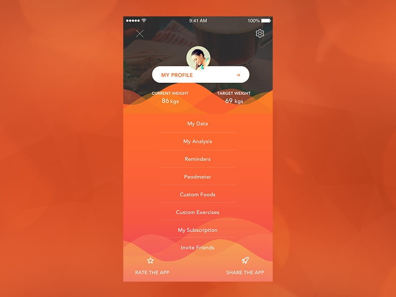
In addition to the tabs, you can also add a “more” menu which will be a drop-down menu or a link to many other sections of the app. This is similar to the hamburger menu in function. However, a clear dissimilarity will be achieved with the level of prioritization of the remaining tabs and also with the visibility of the “more” tab in contrast to the hamburger menu.
In regards to the prioritization level, other tabs alongside the “more” tab should highlight major sections of the apps. The “more” tab would, hence, direct to other low prioritized menus. A drop-down tab would assist more in ensuring a one-time view of the other sections. Also, the “more” tab would be more visible than the hamburger menu and a label would even accentuate it in contrast with the hamburger menu.
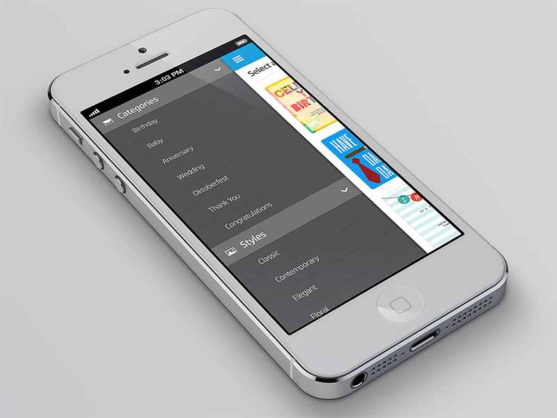
3. Employing a drop-down menu
A drop-down menu is an interesting alternative for the hamburger menu. This menu largely serves as a title for your page. In essence, it is the one thing which serves to encompass all the other sections in your product. This menu, thus, will be the most important and the other sections will come under it as submenus.
An arrow should be used with a drop-down menu which will serve to tell the users that there are unexplored contents in the menu (or that it is a drop-down menu which has lots of sections). You should note that the sections that will be contained in the single drop-down menu must be ones which are like sisters of the menu; they shouldn’t be far away from the menu in terms of their similarities.
4. Make the menus scrollable
Another way to bypass the use of the hamburger menu is to use a navigation which would be scrollable. This would allow for a limited number of items to be seen first-hand while the remaining items would not be visible on the canvas.
In this style, the items that are readily visible on the front page would be noticed while the other ones would be hidden. Hence, it is good to ensure that the most important items are listed first in the visible pane.
An important thing to note, however, is that this menu style should be indicated with a visual integration to make users aware that there are still more items for view on the canvas. When this is not done, the menu may not be useful for its purpose and it will jeopardize its alternativeness for the hamburger menu.
5. Make the menus collapse or expand according to the screen size and resolution
Here, a menu style such that will collapse progressively when the screen resolution gets smaller is meant. This style uses the “more” option in some cases such as when the screen size is smaller. When the screen size is larger, however, the items on the menu might all be listed on the tabs and there will not be any need to use the “more” option.
A good prioritization is very important in this menu style as this would be more useful in smaller screens. This points to the fact that smaller screens will display fewer menus plus “more” menu. Therefore, the best menus should be put in the most prioritized list while the other menus can be used under the “more” menu.
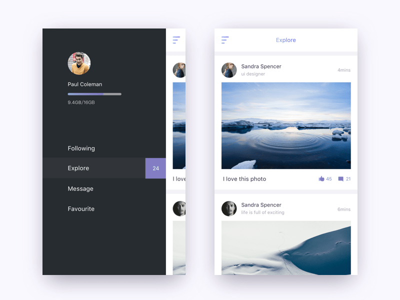
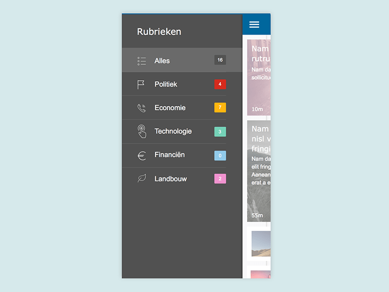
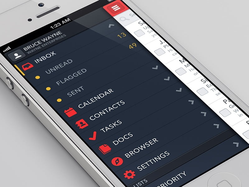
6. Align the menus vertically
Another menu style on mobile apps that can be used instead of the hamburger menu is to vertically align the menu in a stylish form. It, though, have its excess as it bore weight on the visual experience of the user due to the long list form, nonetheless, it is still a menu style to explore.
This form of menu can, probably, list all the items of the products. This is a better visual style for the vertical listing as using a “more” menu here may disrupt the visual experience. However, a “more” option can still be reasonably incorporated here.
Final note
Who says the hamburger menu would not work well for you? Of course these are alternatives which may go well with you or otherwise. There is actually not a clingy style you should hold on to; rather, you should choose your style based on the best UI/UX design form and of course considering the best aesthetics model and architectural platform for the users of your mobile app.
You can get a way of testing your product’s design with your users to know the best design to adopt for your app. So, feel free to explore and adorn your mobile apps with the best of designs.


